Pie charts aren't good
If you worked with me, you know I don’t like pie charts. I always flag them in a dashboard review and ask if they can be replaced with something else and sometimes I will go as far as telling that they suck (they do). It’s time I write down why so that I have to stop repeating myself and I can link to this post in the future because you should trust me more than chatgpt or some other site with ads. Let’s explore a few examples of why they most likely aren’t the best visualization option that you have when dealing with data.
NOTE: I will talk about colors assuming that all readers can see colors in the same way. This is not true, but intentionally done to be explained later.
Understanding pie charts
Let’s start with an example, intentionally with no labels:
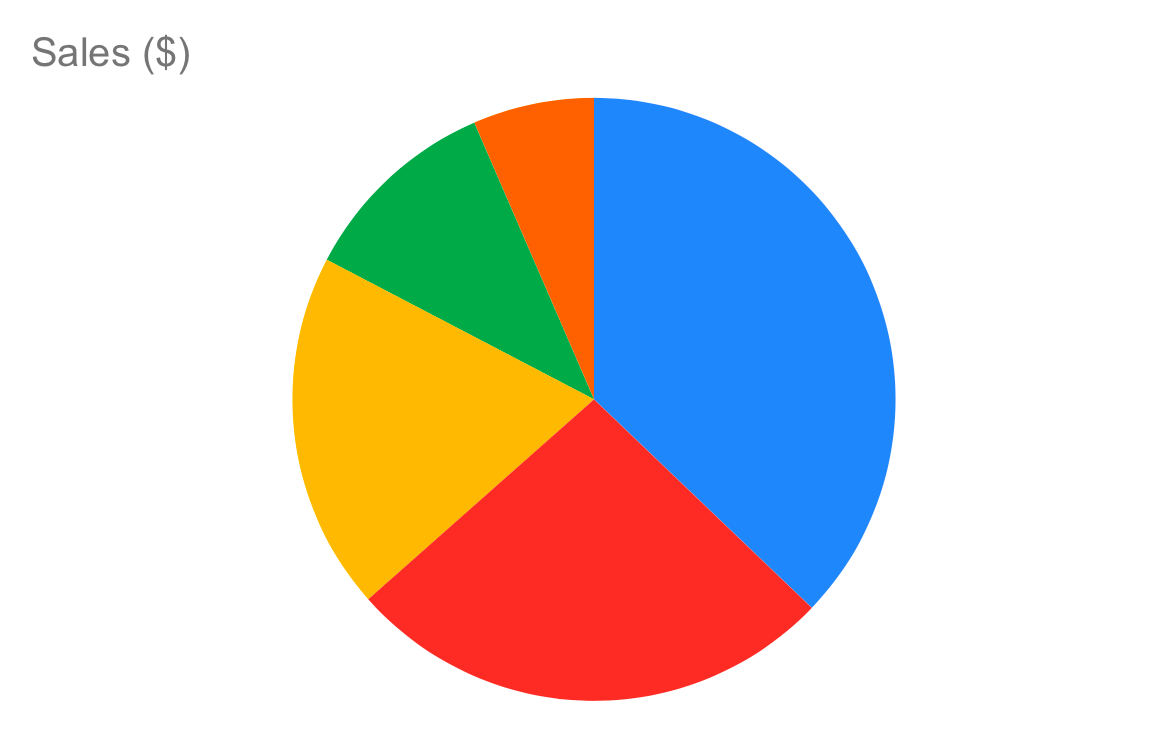
In this example we can see a simple pie chart that represents data for sales of technology items sold by a shop. The items are smartphones, laptops and such. The data has only 5 entries so it should theoretically be easy to represent in a chart. If you take a look at the pie chart, it is immediate to understand that the blue part is the bigger one, followed by the red one, then the yellow one. But what is the relationship between those three parts? How bigger is the yellow than the red? Is the yellow half or more of the blue part? It’s hard to be sure of the proportion involved and to compare the parts of the pie. Let’s build the same graph with a bar chart:
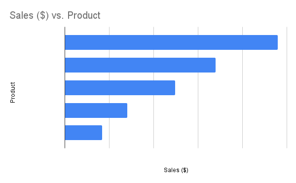
The chart, without any color, is able to convey more information even in absence of the essential part of the data, which are the categories. The relationship between the categories is pretty clear and the bars can be ordered in such a way that they represent their relationship in an easy to grasp way. Note that in this graph there are no colors, which makes it for an easier to digest visualization as colors are cognitive overhead for our brains: while not the most important detail in this picture, most humans can’t distinguish the difference between more than 6 colors, so at any bigger sizes we would be making things complicated. There are also people that are color blind or can’t distinguish colors well. Bar charts don’t have this problem because you don’t strictly need colors.
Even using labels and categories, things aren’t even comparable between the two styles of graphs:
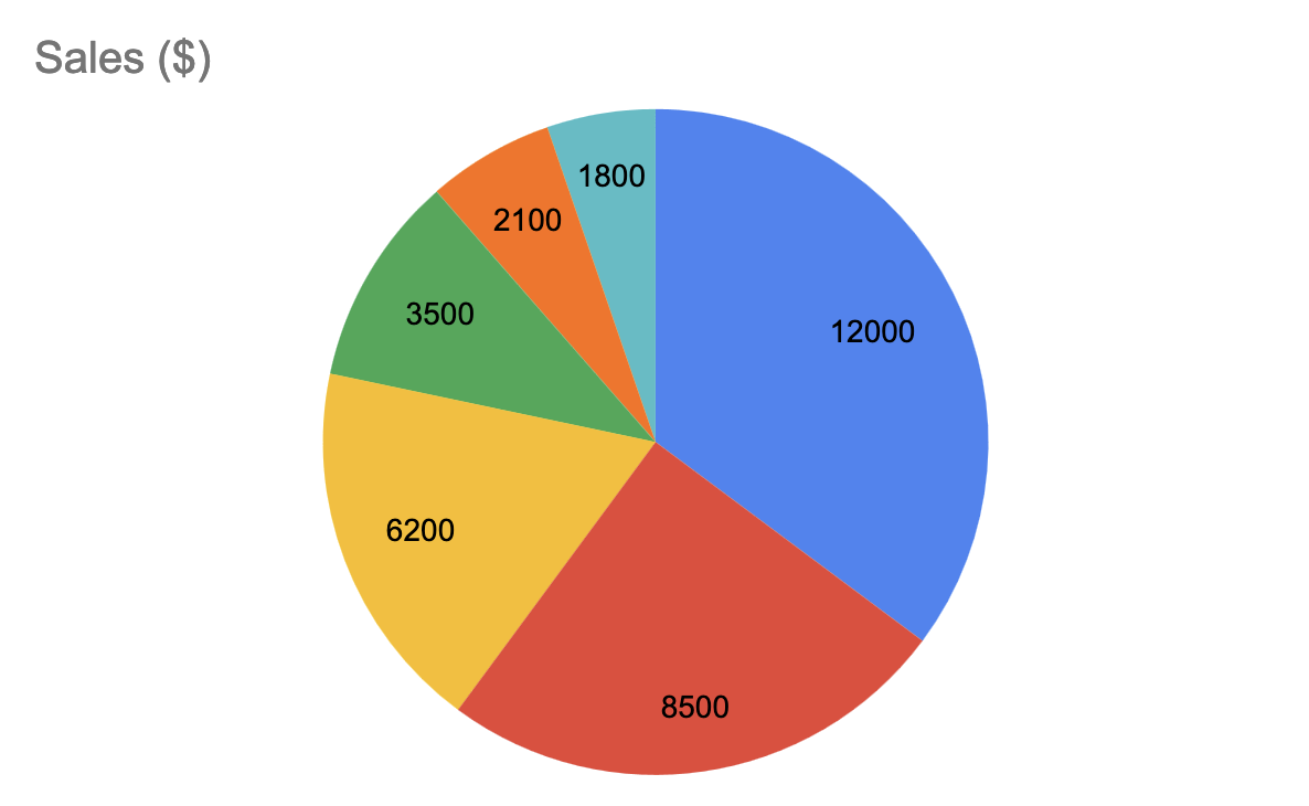
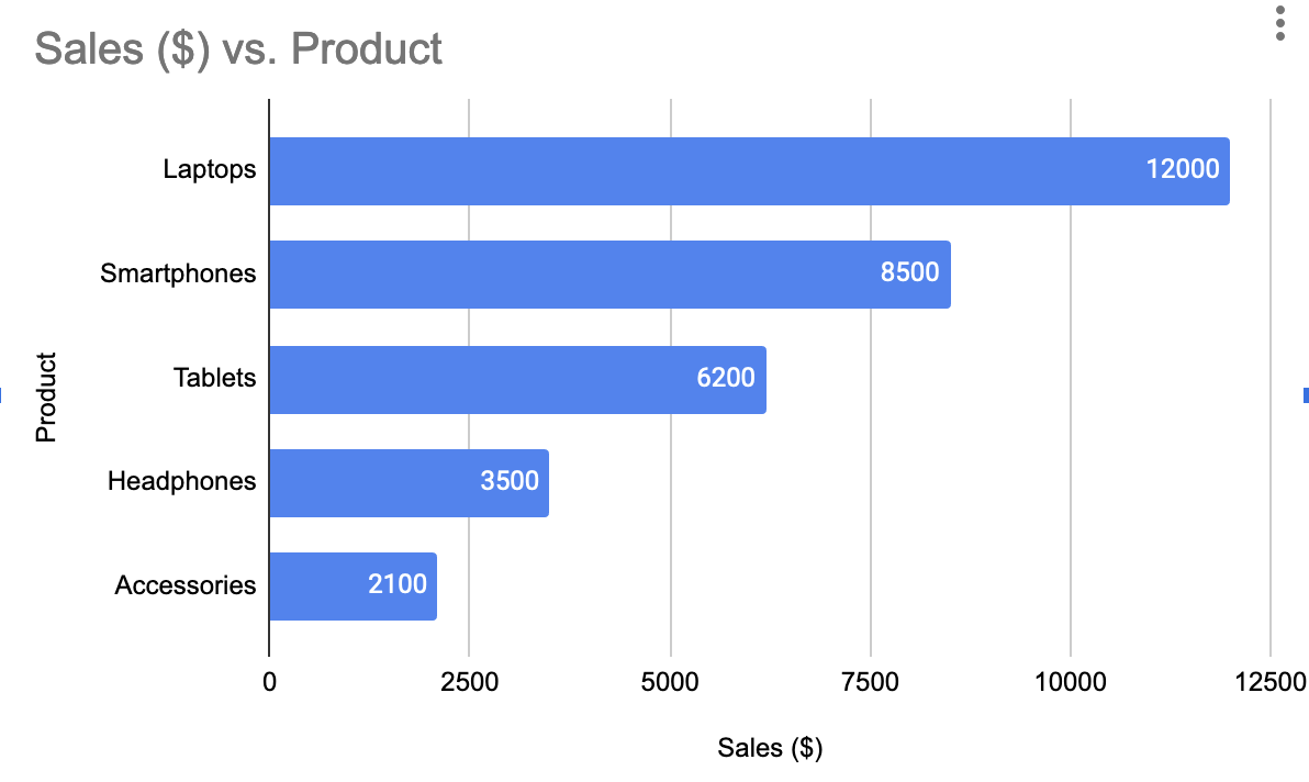
The barchart is still way easier to grasp and the ranking of the represented categories is usually a big deal when analyizing the graph.
Sometimes the data is enough
While the bar chart above is nice, we said that the bar chart is hard to read. So the natural question to ask is “what kind of value is the chart adding” when comparing to the actual data as table? The data is the following:
| Product | Sales ($) |
|---|---|
| Laptops | 12000 |
| Smartphones | 8500 |
| Tablets | 6200 |
| Headphones | 3500 |
| Accessories | 2100 |
| Others | 1800 |
The data is easy enough that visualizing it as pie charts doesn’t really add anything. The bar chart has still a margin over the raw data as it allows to grasp what the difference is between the categories with no additional overhead. Given that it also maintains the sorting, it doesn’t lose any signal compared to the table. The pie chart doesn’t do that, so I’d say that the bar chart is the best, followed by the raw table and last the pie chart.
Pushing graphs to the limits
While in the previous section all the examples were fairly straightforward, I would like to explore a case in which we have to deal with much more data. I generated some test data for about 45 categories. The result is self explanatory, I think:
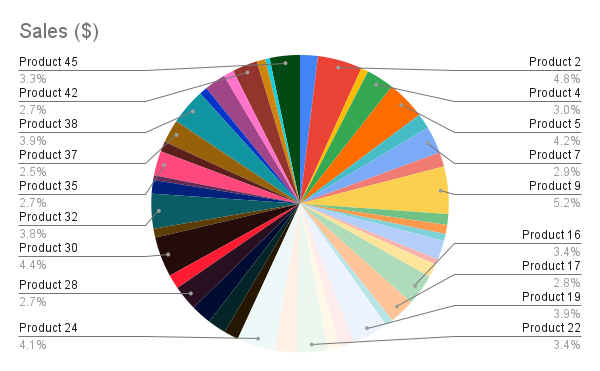
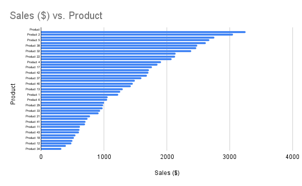
It’s still very much possibile to make a sense of the bar chart, while the pie chart is just a huge mess. You need color, but humans aren’t so good at identifying differences between colors. So you are stuck with a mess.
Even more cursed graphs
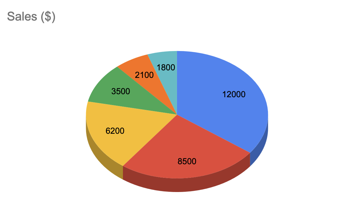
Some people like 3D charts. I don’t really understand why: when representing 2D data, the easy way is to use a 2D chart. The third dimension just adds something that isn’t helpful for anything, distracts and actually doesn’t help to understand the graphs as it makes it harder to visualize the parts of the charts that are on the back. Just don’t use 3D graphs unless it’s some other fancy 3D visualization you absolutely need (like an interactive one).
Conclusion
There is more that could be said about data visualization. I think it’s an interesting topic and there is frankly quite a bit of stuff to know. But the key takeaways for you is that pie charts are normally a bad choice as they don’t deliver a good representation of the relationships between the items represented, they have to rely on colors (which could be problematic for color blind people), they make everything more confusing really. So yeah, use something else and remember that the only good pie is a pie you can eat.